Come See Our Westin Huntsville Renovation!
Many know Accents of the South for our residential interiors, but how much do you know about our commercial design? In this journal entry, I’d like to take you behind the scenes for one of our recent corporate renovation projects with the beautiful Westin Huntsville hotel.

My approach to corporate design is not unlike that with residential clientele. Businesses, like homeowners, have personalities, and their own unique color and aesthetic preferences. They have budget parameters, and clear expectations about the utilization of a space and the desired emotional response from those who will use it. Businesses can even have cherished pieces of furniture and art they want to be incorporated. Our project with the Westin Huntsville is an example of the kind of designer-client partnership that engages all the above into a spectacular architectural and commercial design success.

The Goal
Since opening its doors in April 2008, Westin Huntsville, a Marriott International hotel, has stood tall as an anchor property in the Bridge Street Town Centre, an upscale, open-air shopping destination. While the hotel is well-positioned for its hospitality services and has always offered generous lounge and restaurant capacity, management noted clientele were consistently venturing elsewhere for meals and social engagement. It was obvious that guests were not enjoying the full potential of the hotel’s gracious first-floor communal spaces. For instance, there was no natural overflow from the bar area into the vacant restaurant during non-dining hours, because the visual disconnect between the two was perceived as uninviting. Westin’s mandate for Accents of the South was to re-invent the entire first floor in such a way as to make guests feel at home and find reason to linger, dine, work, socialize, and move freely throughout.

The Challenge
Our preliminary evaluation of Westin’s communal areas revealed some fundamental issues. The entrance lounge, bar, and dining areas were separated by lack of relationship to one another, each adrift in its own disconnected identity. This, along with unbalanced proportions, the cold echo of hard tile, wood, and glass treatments, and the lack of cohesive design throughout, presented little allure for sitting and staying awhile. Yet, we could see a fantastic canvas on which to create something warm, welcoming and new.

Preparation and Presentation
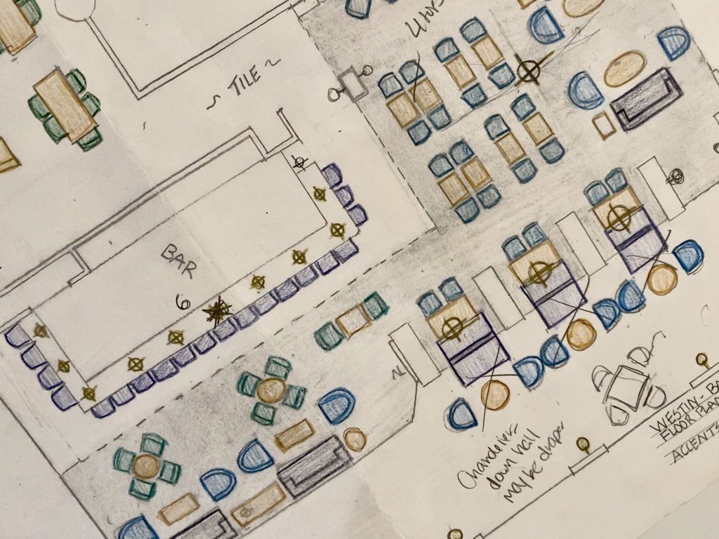
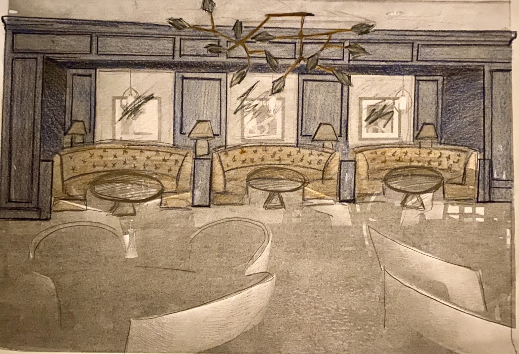
Since the owner of this Westin property was scheduled to be in town, we had only a few weeks to prepare a presentation. And because every good plan requires thorough research, we began visiting select restaurants, bars, and hotel lobbies in a variety of cities. By experiencing these venues from the patron perspective and observing the engagement and responsiveness of staff and clientele in those environments, we were able to discern what works well and why. From these observations, we prepared drawings of a proposed floor plan and an aesthetic rendering of the dining area to cast our new vision. These drawings were well received, and thus began our exciting one-and-a-half year-long renovation relationship with Westin.

A Fresh Look
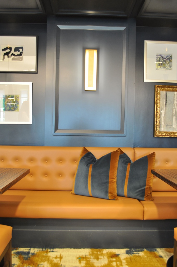
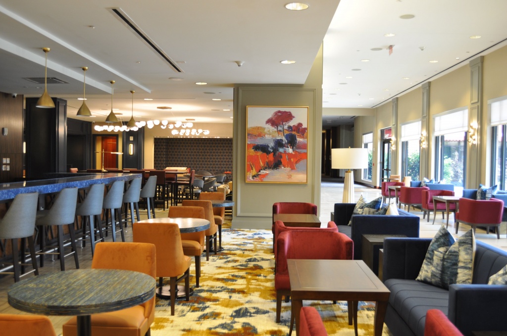
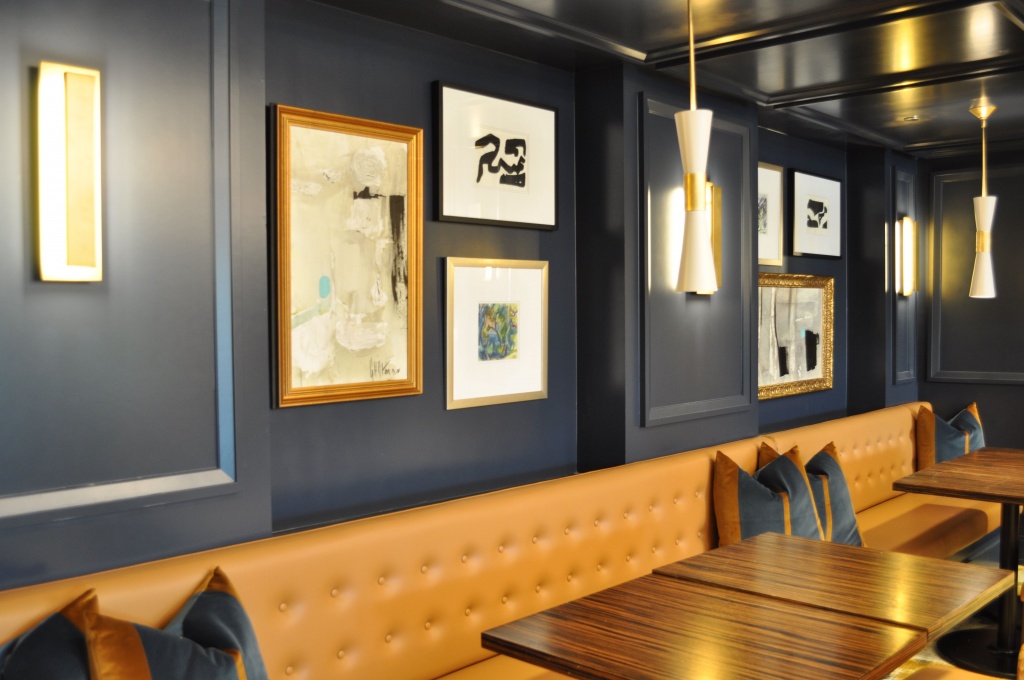
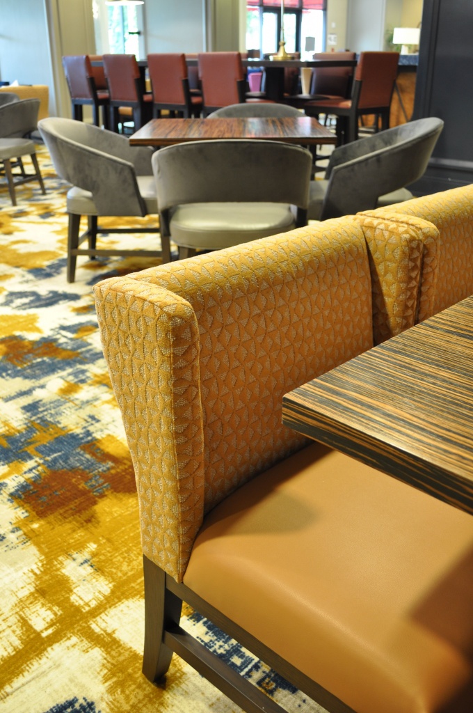
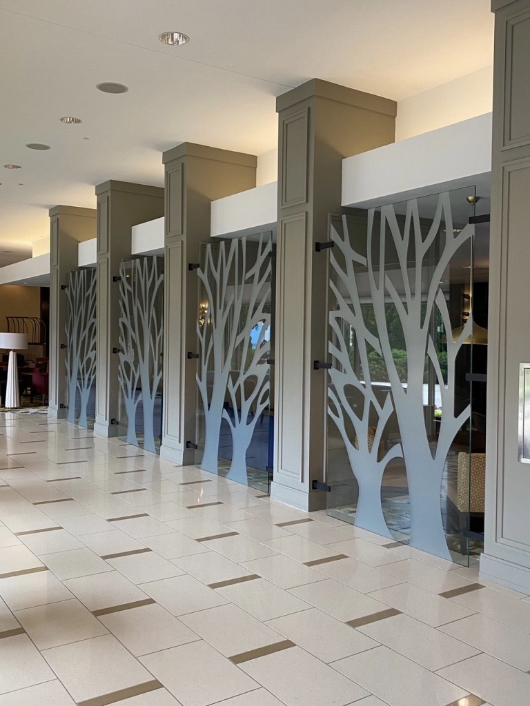
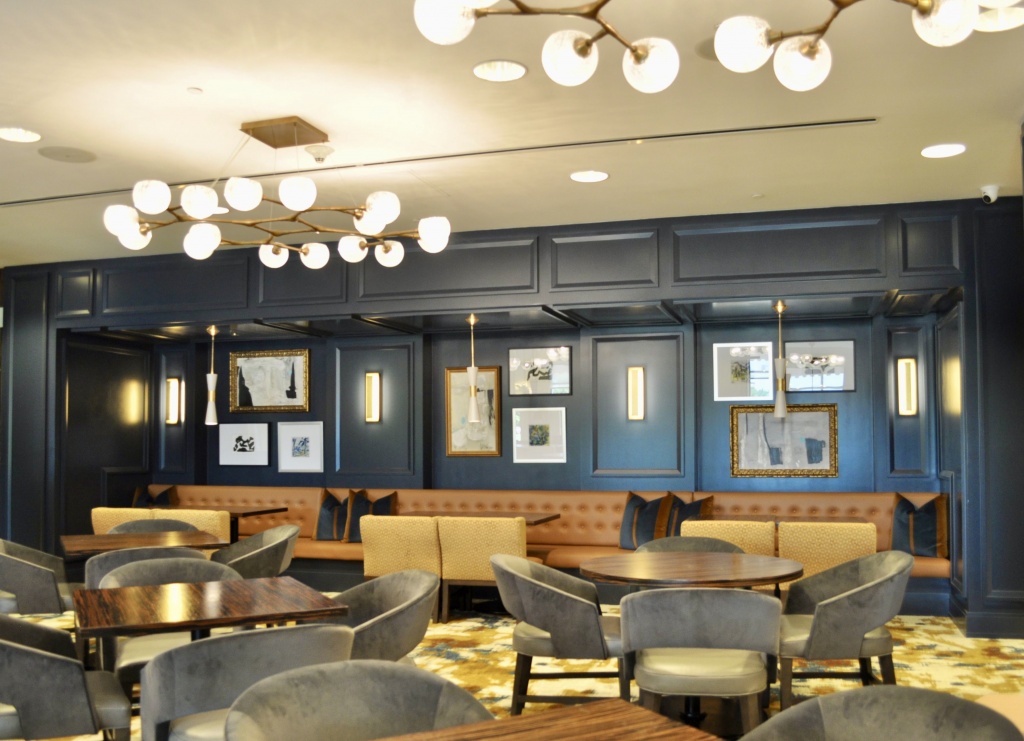
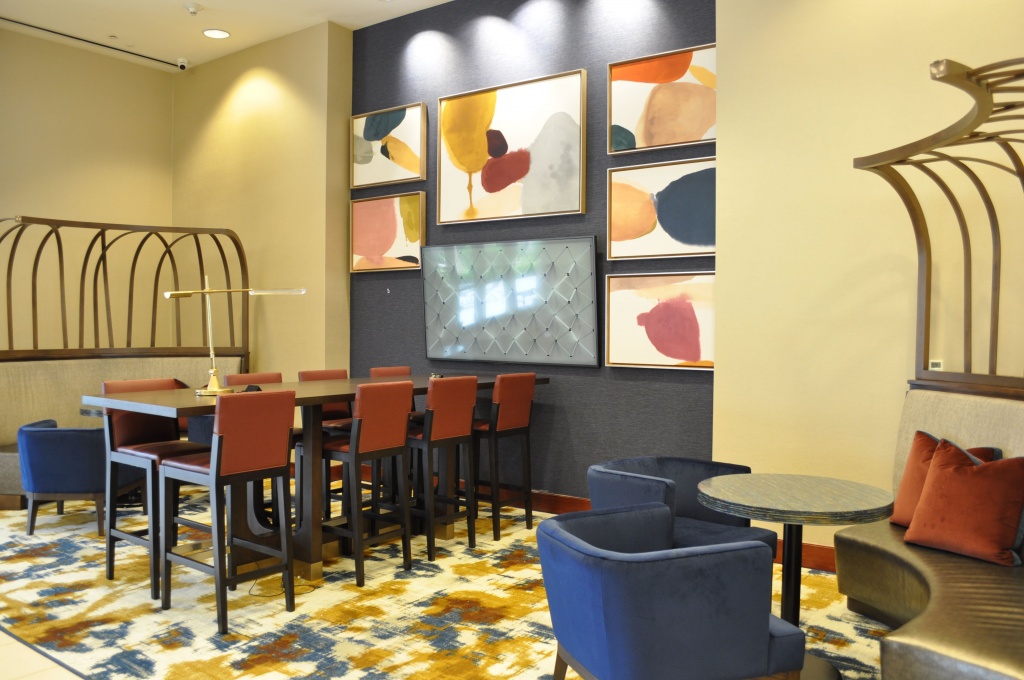
Given Westin’s aim to provide a restful, home-away-from-home for guests, we knew that by wrapping the dining and bar areas in deep lacquered blue and the lobby and breezeway in warm beige, we could give these large spaces a calm, enveloping mood. The numerous tile and carpeting treatments not only chopped the original design into disconnected zones but depersonalized the space, holding it captive to a more corporate attitude. But, by committing to one of the existing carpet patterns and one floor tile, we were able to draft re-imagined renderings of an overall plan with cohesive traffic flow from one zone into the next. We designed a custom carpet pattern to marry the select existing floor treatments so they became complementary to one another in the context of our new integrated floor plan.

Excellence in the Details
Since good design is only as pleasing as it is functional, Accents of the South is committed to creating spaces that are as useful as they are beautiful. This requires continual dialogue with clients from start to finish of every project to maintain an ongoing understanding of needs and expectations. To this end, we worked with numerous experts from across the country, provided by Westin’s management group, and incorporated their extensive knowledge of the hospitality, bar, and food service industries into a well-honed floor layout accommodating seamless service and guest traffic flow.

Solving Puzzles
As with many projects, one of Westin’s primary requirements presented a logistical quandary. Guests who frequent Westin properties know to look for the much-selfied seating cage which has become a traditional part of the Westin experience. Naturally, this iconic ribbed interior arbor needed to find a home in our final plan, but the dimensions of the original cage would not fit comfortably into the scale of our proposed drawings. In the spirit of collaboration, Westin agreed to our idea to separate the cage into two parts. The resulting smaller sculptural pieces multiplied the experience for hotel guests and fit beautifully into the final aesthetic.

Bringing It Home
Westin’s expectations for this project were to create a warmer, more inviting atmosphere for guests, and increase hotel bar and restaurant patronage. Since completion in September 2020, the hotel’s first floor communal areas have been alive with activity, and management have shared glowing reports of the resulting food and beverage sales. Westin guests are clearly making themselves at home and hotel management is enjoying increased profitability as a result. Thank you, Westin Huntsville for the opportunity to partner with you on this beautiful and rewarding renovation.
